Hexagon Geosystems · 2025-2026
ROLE
Staff Product Designer
TEAM
1 PM, 2 ML Engineers,
1 UI Engineer
STATUS
Shipped in two phases; model training active
IMPACT
CS team off the Excel workflow; correction loop reused as the template for the platform’s second ML tagging feature
WBS codes are the hierarchical taxonomy, electrical, plumbing, structural, and so on, that connects raw schedule data to reporting and analytics. The volume was the obvious problem: a single project schedule could have over a thousand line items. The harder problem was inconsistency. Every general contractor formats their schedules differently. Capitalization, spacing, abbreviations, naming conventions. None of it is standardized, sometimes not even within the same organization. No automated approach could handle that reliably, which is why the work had stayed manual. A human had to read each line, interpret what the activity actually described, and assign the right code. It kept the Customer Service team buried in repetitive pattern-matching, and the judgment work that actually needed a human got squeezed in around it.
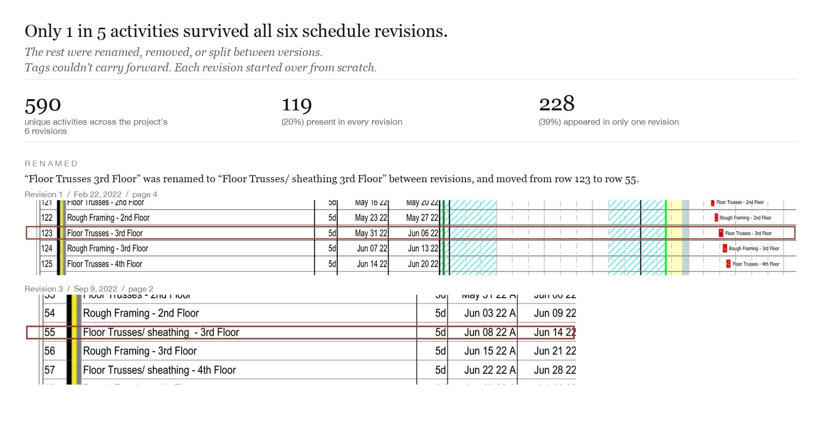
This is what "updated mid-project" actually means at scale, and why the tagging work kept restarting.
Our team's mandate was to reduce cost of goods sold, and we had been working through customer service time line items in the timesheets one at a time. Schedule tagging was high on the list but pinned, because the pattern recognition it required was nondeterministic and sat outside what conventional code could handle reliably. It had been waiting for either the technology to catch up or another approach to surface. Soon after, Hexagon spun up the AI Hub, which built starter algorithms for product teams who could bring them a worthwhile problem. We proposed schedule tagging. They accepted, built the initial model, and our own ML engineers took ownership from there. Our target was to reduce CS time on schedule tagging by 25% within six months.
The wrinkle: the model could suggest WBS codes automatically, but it could only improve with training data from real projects, and it had none yet. Whatever I designed had to do two things at once: reduce user workload and generate the training data the model needed to get better over time.
Before designing anything, I spent time with the Customer Service team to understand the work firsthand. I shadowed multiple tagging sessions, watching how team members moved through schedules of varying quality. I interviewed them about where they lost time, what made certain schedules harder than others, and where their confidence in code assignments broke down. Most of the work was pattern-matching: see an activity name, recognize the trade, assign the code. But the ambiguity is where human judgment was required. A model could learn the patterns. It couldn't yet handle the ambiguity. That distinction shaped the entire design direction.
Those two goals are in tension. Capturing training data requires users to submit corrected schedules. If capturing corrections feels like extra work, they won't do it.
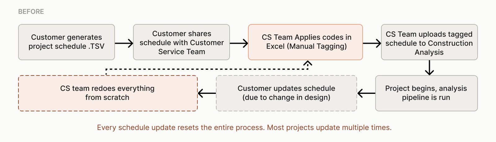
Because our internal Customer Service team were the users, not paying customers, we had a relatively low-risk environment to experiment, and leadership was pushing to start collecting training data quickly. I designed Phase 1 as a stopgap that could ship fast while the full in-platform feature was developed in parallel. It preserved the existing Excel-based workflow and layered the ML model in through an upload interface: users would upload an unprocessed schedule, get back model suggestions, correct mistakes in Excel, and re-upload. That corrected file became training data. We were trading user effort for speed to market. The priority was getting real training data into the model before we could build something worth keeping.
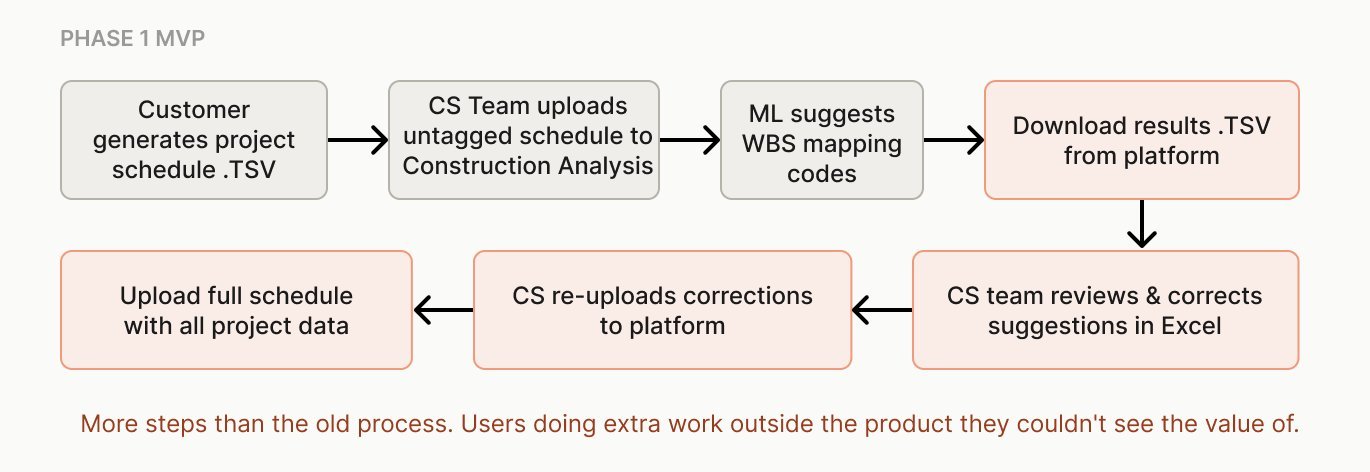
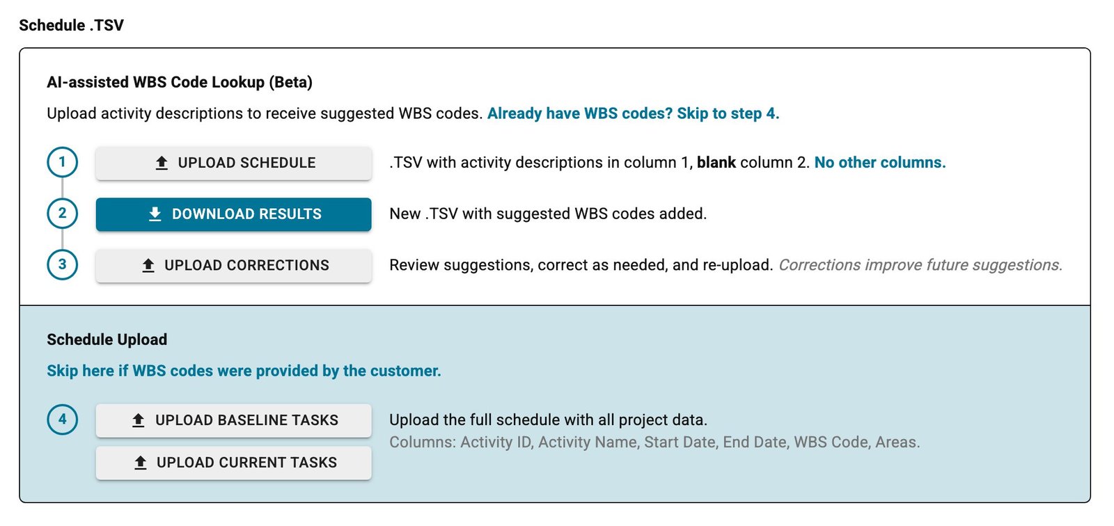
Phase 1 lived inside the project settings page. Upload, download, correct in Excel, re-upload. It worked, but the workflow got longer.
Adoption was low. The workflow asked users to do more work than before. Five steps where there used to be one. And there was a deeper resistance: some Customer Service team members were uneasy about training an ML model that might eventually replace their role. Asking people to do extra work to feed a system that some believed could reduce need for their team is a hard sell even when the UX is good.
Nobody could see the payoff. Users were correcting model outputs and submitting training data, but nothing in the experience showed what that work was building toward. This wasn't an interface problem. The model was improving, but the people paying the cost of corrections never saw that improvement. The cost was immediate and visible. The value was invisible.
The model doesn't need to be right about everything. It needs to be confident enough on the obvious work that the humans can focus on the hard cases.
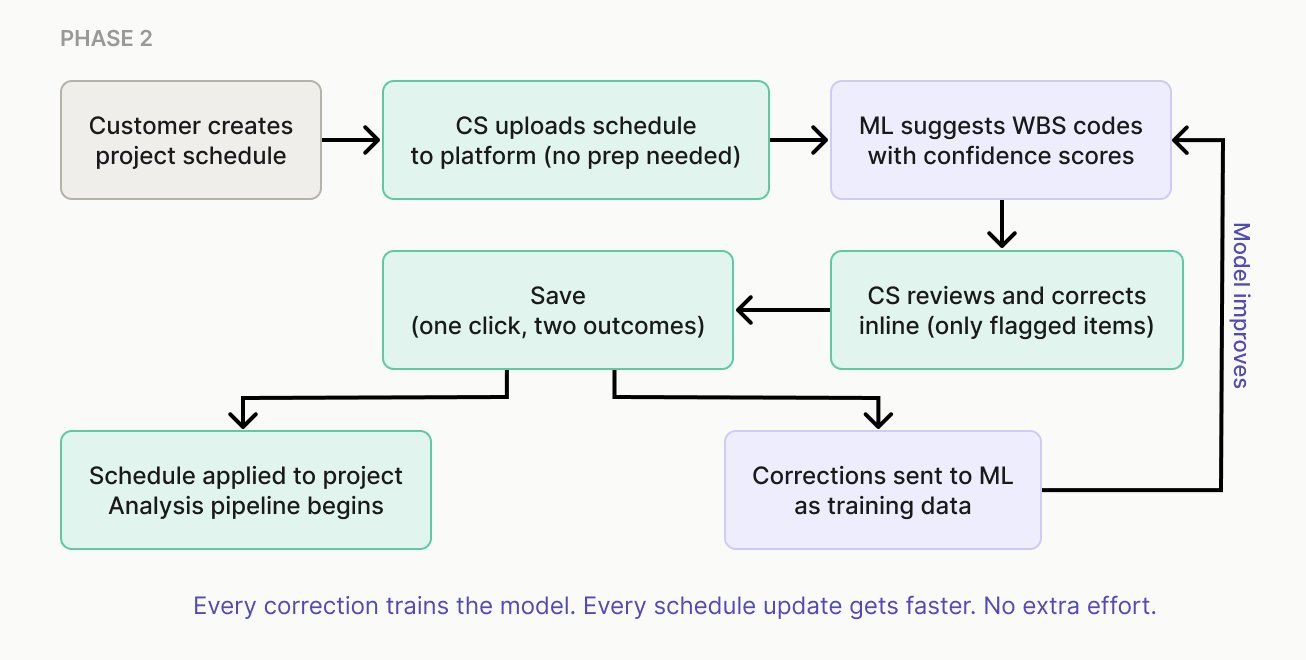
I'd been exploring the in-platform design alongside Phase 1, so I wasn't starting from scratch. The experience needed to live entirely inside the platform, with corrections happening inline and the training loop running invisibly in the background. I designed a table-based interface on Pangaea, our Material UI-based design system, with three goals: eliminate the file shuffle, make corrections fast, and make it obvious that those corrections were improving the model.
The dropdown was the tricky bit. It needed confidence-ranked suggestions, inline search, and a fallback to the full code library when no suggestion fit. The interaction was too involved to validate in static frames, so I built it as a working prototype in Claude Code and tested it live with the Customer Service team.
The table pre-fills the WBS code column with the model's best guess for each line item, alongside a confidence score shown as a color-coded percentage. A single save action persists the schedule and sends every correction to the ML server as labeled training data. Three patterns kept corrections in flight: a confidence-ranked dropdown, manual search as the fallback, and a filter that surfaces only the rows that need attention. Users could also override any suggestion or do the work entirely without the model.
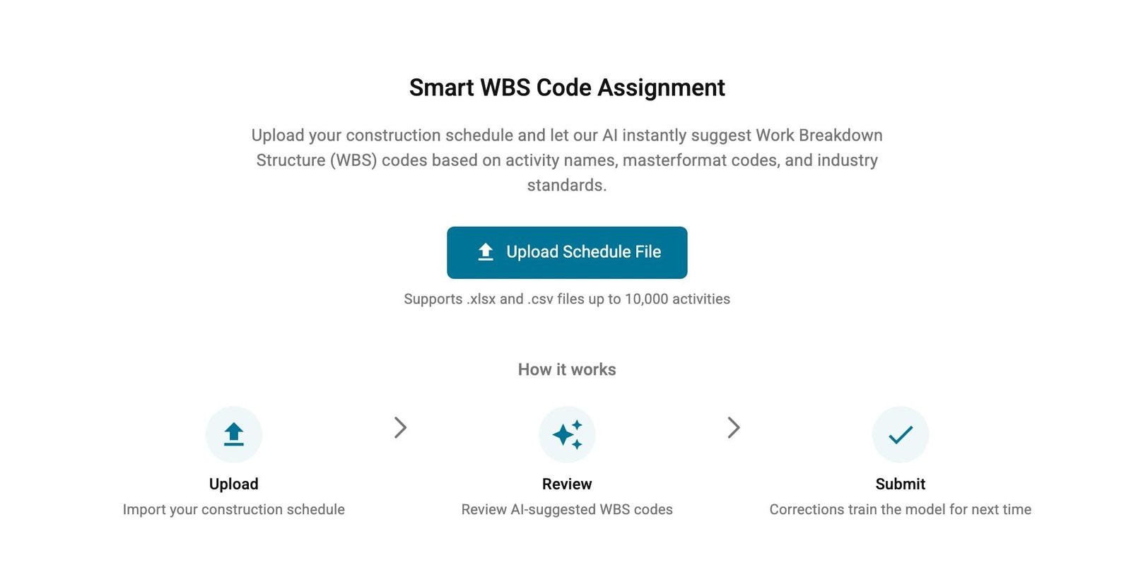
The upload screen. Three steps, no ambiguity about what happens next.
While the model processes the schedule, a three-stage checklist shows exactly what it's doing. Skeleton rows preview the table layout underneath.

The full table with ML-assigned WBS codes and confidence badges. Green rows are accepted by default. Orange and red mean the model is less sure.

Clicking any WBS code opens alternatives ranked by the model's confidence in each.
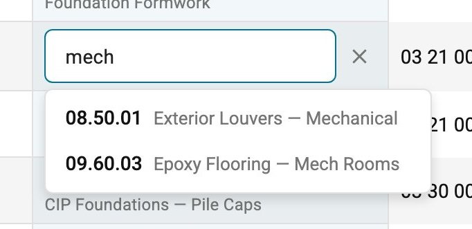
If none of the ML suggestions fit, users search the complete WBS code library directly. No dead ends.

With the Needs Review filter on, over a thousand rows become fewer than fifty.
“It tells me which ones need my review so I don't have to check every row. That's going to save me real time on every schedule.”
-Customer Service Analyst, usability test
Every activity gets a WBS code and a confidence score. Anything above 70% is accepted by default. The user never sees a confirmation dialog, never clicks approve, never acknowledges what the model got right. They only engage with what it got wrong.
Most AI-assisted tools I'd looked at, Copilot, Cursor, Grammarly, use an accept/reject pattern. That didn't fit here. The correction is the review. An additional confirmation would add clicks back that we just implemented an ML algorithm to reduce. Requiring approval on every row means asking someone to make over a thousand decisions. Requiring approval only on flagged items means fewer than fifty, and as the model trains on more corrections, that number should keep shrinking. The end state I designed for is a workflow where most users upload a schedule, glance at a handful of flagged items, and hit save.
When users correct a WBS code, the system offers to apply that correction to similar activities elsewhere in the schedule. A customer might split plumbing work into separate line items by wing or floor, even though in the WBS taxonomy all of it maps to one trade. The user corrects a single row and a toast asks "Apply this WBS code to 11 similar activities?" One click to accept. I'd been planning a multi-select interface for this. The problem became obvious in prototype: multi-select reintroduces clicks at the exact moment the tool is supposed to be saving them. The toast does the same job in one click.

One correction can propagate across the building hierarchy in a single click.
I also chose to surface raw confidence scores. Showing the actual percentage paired with the keywords the model matched on gave users enough to make a judgment call without needing to understand how the model works. Abstracted labels like "high" or "low" would have hidden information users needed, and the transparency about uncertainty increased their willingness to correct.
If color carries meaning, the symbol has to carry the same meaning. The confidence badges use color, but they also include shape icons, a checkmark for high, a dash for medium, a triangle for low, because color alone fails WCAG 1.4.1 and colorblind users need to scan a thousand-row table by shape. I darkened Pangaea's semantic palette until it cleared 4.5:1 contrast, and spec'd keyboard navigation, screen-reader landmarks, focus indicators, and reduced-motion support.
The 70% threshold is an adjustable default. Different teams have different risk tolerances, so I designed it as a slider. A team tagging a sensitive schedule might tighten it to 85%; a team processing routine updates might loosen it to 55%. The popover shows the real-time impact of any adjustment.

The threshold popover lets users control where the line falls between machine judgment and human review. At 70%, the model handles 990 activities automatically. The remaining 36 need a human
I was the only designer on this product, so I embedded with the ML engineers closely enough to learn how the model scored confidence and where its accuracy would plateau. After the predictive dropdown pattern proved out in production, I contributed it back to Pangaea as a reusable component for other ML-powered features.
Phase 2 is live. The upload-download-reupload loop is gone. The Customer Service team transitioned off the Excel-based process over several weeks as they built confidence in the in-platform workflow. The Customer Service team tags schedules for every customer project on the platform, so per-project time savings compound across the customer base.

The save confirmation that runs on every schedule submission. Each correction is labeled training data going to the model.
Before launch, I ran a structured usability test with three Customer Service team members handling different customer projects. The participant who handled the most tagging volume estimated the prototype would cut their time per schedule by roughly 50%. Another projected that what had been a 4-6 hour task could drop to 20-30 minutes. One participant called the 25% target conservative. All of it is pre-launch estimate, from three people.
The badge system required no explanation. All three understood the color and icon mapping on first contact. The threshold slider was more polarizing: one wanted tighter control, another preferred to leave it at the default. That tension validated making it user-adjustable. A fixed threshold would have forced one team's risk tolerance on the other.
Performance against the 25% target will be measured through timesheet billing as projects cycle through the new workflow.
After launch, the ML team began applying the same algorithm to a second code-tagging scenario on the platform: BIM element tagging, with this workflow’s correction loop as the template. One tool built for one problem became infrastructure for the next.
Phase 1 was the right call given the constraints, but I underestimated the chicken-or-egg problem. The visibility strategy I planned, updating the Customer Service team on model progress, only worked once the tool was already working, and adoption was too low to generate the corrections those updates depended on. Starting over, I'd think harder about what gets a tool over its first adoption threshold when the value compounds slowly.
I'd also rethink the validation. Three Customer Service team members walking through a prototype gave me directional confidence, but not the kind of data a two-week pilot would have. Watching one or two people tag real projects end-to-end before broader release would have surfaced the edge cases a walkthrough can't. The pressure to ship was real, and asking to slow the launch by two weeks would have been a hard sell. But I'd have walked into launch with production data backing the design.